Note: This article will use People First Language since we do not know the reader’s preference.
You have probably sat through your fair share of undergraduate courses or staff-wide professional developments where you heard about inclusion, modifications, accommodations, differentiation, and more. Most of these discussions are usually generalized for all teachers and don’t have any practical application for you, the art teacher. You may leave wondering what this actually looks like in the art room.
We all want our students to foster an appreciation for art. It is even better if they end up loving it! We want them to enjoy their time in our classrooms with fond memories of experimentation, risk-taking, exploration, connection, growth, and problem-solving. We want them to make amazing artworks, no matter their background, experience, or ability level. But how can we do this in a way that makes the most impact and reaches all students?
Keep reading to learn more about inclusion and what the 7 Principles of Universal Design can look like in the art room.
Why do art teachers need to care about inclusion and Universal Design for Learning?
Inclusion is a term you may be familiar with. When you approach your teaching with an inclusive frame of mind, you consider the needs of all students from the beginning. The goal is to make learning and artmaking better for everyone and to make our art rooms a welcoming space for all students. Additionally, “… students feel that their contributions and perspectives are equally valued and respected.” These are goals we can one hundred percent get behind!
At the end of the day, inclusivity is a way to make your teaching more efficient. When you start with the needs of all students from the beginning of your planning, you don’t have to go back and make changes to “force” a lesson to work for specific students. It is a way to eliminate unnecessary hurdles and barriers to learning. Thinking about how to make your lesson accessible for all students helps not just those with learning disabilities. It can also ensure that your lesson will reach students who are English Language Learners and students with diverse backgrounds and experiences.
One way to have an inclusive art room is to apply Universal Design. Universal Design is “the design and composition of an environment so that it can be accessed, understood, and used to the greatest extent possible by all people regardless of their age, size, ability, or disability.” When the needs of all people are considered, everyone benefits. “Simply put, universal design is good design.” Likewise, “Universal Design for Learning (UDL) is a teaching approach that works to accommodate the needs and abilities of all learners.” The objective is to “improve the learning experience for all.”
Dr. Theresa Haugen is a Curriculum Specialist and Associate Professor for AOEU. She has 20+ years of experience teaching art at the secondary and college level, as well as a personal and professional lens of expertise when it comes to inclusion for special education.
Theresa hones in on why caring about inclusive education is important to us as art teachers. Visual art is usually the first place students with disabilities are mainstreamed. We have the privilege of having a diverse group of learners. When we do everything we can for all students to be successful in the art room, we provide a therapeutic environment where students can feel comfortable processing content while tapping into their interests. This can lead to deeper artmaking, connection, and empowerment. We also provide an opportunity for students to practice strong social skills. The art room is a place where all students can interact and help their peers.

If you want a quick dive into inclusion and how to make visual art accessible for all students, take our courses, Art and Diverse Learners or Adapting the Art Room. Get in touch with an admissions counselor today to discuss your personal goals and art room needs.
Get in touch with an admissions counselor!
For more ideas to grow an inclusive art room, check out the resources below:
Let’s investigate the 7 Principles of Universal Design and see how they can appear in the art room.
The 7 Principles were created in 1997 by a “group of architects, product designers, engineers, and environmental design researchers.” The Principles are “to guide the design of environments, products, and communications.” Even though we are not architects, designers, or engineers, we can proactively apply them in our art room and curriculum to better serve all of our young artists. Let’s look at how!
1. Equitable Use
This first principle suggests providing the same experience to everyone when possible. This way, individuals will not feel separated. In the art room, we can give all students a variety of materials and tools that will meet diverse needs from the start. Students can choose what will work best for them. Equality is giving all students the same tool to do the same project. Equity is giving specific, needed tools to individual students so everyone can do the same project without barriers.
For instance, let’s say you are about to start a collage unit. Instead of setting out one kind of scissor, put out a variety of scissors. These can include different sizes, left-handed scissors, loop spring scissors, self-opening scissors, push-down tabletop scissors, and spring-loaded scissors. If you only put out one kind of scissor, you may create a barrier and inadvertently single students out in front of their peers. They are put in a position where they are physically unable to start a project or may have to ask for help, which can be embarrassing for many students.

2. Flexibility in Use
Flexibility in Use means that “the design accommodates a wide range of individual preferences and abilities.” In the art studio, you can offer choices to fulfill the learning objective. Theresa suggests taking a step back. Look at the objective and be open-minded to how they achieve it.
With our example above, if the objective is to create a collage, do students need to use scissors? Can other tools such as a utility knife or paper punch be used to cut? Perhaps students can use their hands to tear the paper as well.
It is also worth noting that providing choices in tools does not have to be expensive. For example, if you do not have the budget to purchase special pencil grips, make your own customizable grips with a kneaded eraser.
Choice does not need to be strictly for tools or materials. If students are all collaging a home as their subject matter, reflect on how you can be open-minded about what a home can look like. This prompt can be a barrier for students who do not have a traditional home. Discuss how a home can be a house, apartment, bedroom, a special place they feel safe, a person they feel connected to, and more.
If you see students shutting down and you are unsure what choices to provide, ask for guidance. Older students often know what they need best. Just ask them, and trust their intuition. Sometimes, they will not know what they need from you because they have never collaged before! If that’s the case, ask them what difficulty they have, then brainstorm ways to solve the challenge together. You can also reach out to parents, caregivers, core content area teachers, paraeducators, and any other adult invested in the student’s learning.
3. Simple and Intuitive Use
The third principle states that “the design is easy to understand, regardless of the user’s experience, knowledge, language skills, or current concentration level.” When you write your lesson plans, pare them down to the core objectives and standards. Reflect these essentials in the project steps with simple written instructions and clear photos or short videos. You can always provide more complex options later for students who want or need them.
Other ways to consider simplicity in your room and curriculum can be to:
- Focus on an overarching theme versus technical details.
- Include symbols for recurring tasks or materials.
- Color code systems, steps, or supplies.
- Project photos of four or fewer materials at the beginning of class that students will need for the day.
- Post cleanup procedures for various stations or tools similar to project steps.
Another bonus of this step is that it helps English Language Learners and students who struggle with literacy. You prevent flooding all students with the information they may have difficulty understanding or processing and only provide them with what is necessary to succeed.
4. Perceptible Information
This principle is very similar to the previous one. Information is effectively communicated to the person, “… regardless of ambient conditions or… sensory abilities.” Like the above example, tap into multimodal learning by engaging more than one sense. Instead of providing steps in just written format, give clear photos, short videos, and/or a pre-recorded audio clip.
It’s also important to put on your graphic designer hat and think about how the information is displayed:
- Is there enough contrast to read the text?
Yellow or light-colored fonts on a white background can be difficult to decipher. - Did you overlay text on an image?
In general, Theresa recommends avoiding text on top of an image because it’s hard to read. Place your text above, below, or next to the image instead. - Have you used a consistent design throughout?
Use similar colors, fonts, and layouts for your signage and documents. This gives students one less thing to process when they look at your resources. - Are you using a simple font?
Theresa shared that serif fonts, such as Times, Garamond, or Baskerville, can provide greater letter spacing or tracking to ease legibility with print materials, and sans serif fonts, such as Ariel or Helvetica, can be easier to read on electronic screens. The trendy handwritten fonts are cute but can be detrimental to student comprehension. See the All Things Type handout below for more information. Take our Studio: Graphic Design course for more graphic design strategies to ensure your text and images are as legible as possible.
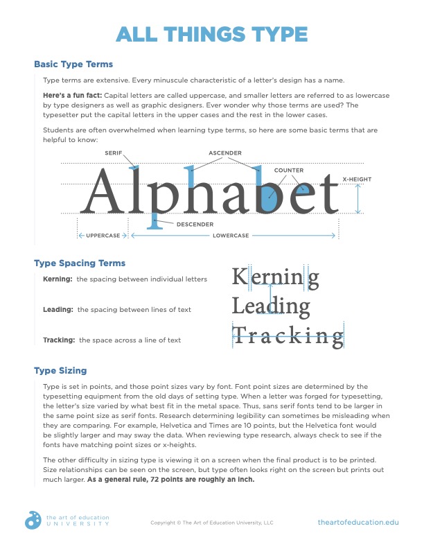
Download Now!
Remember to keep things fresh. Regularly switch up how you deliver information and do not forget the sense of touch and the value of kinesthetic learning. For instance, don’t stop at a written definition and images of various textures when you teach texture. Let students create pencil rubbings or go on a nature walk to collect found textures. When teaching the Elements and Principles, go on a scavenger hunt in your classroom or building. Snap photos to represent each! Not only can this reach more students and types of learners, but it also breaks up instruction to boost engagement.
5. Tolerance for Error
The fifth principle focuses on minimizing hazards. This one shows up a few different ways in the art room. First, we want to keep our artists physically safe. When you arrange your room, is there enough space to navigate around the furniture? Can all students reach the supplies and the sink and get to their table?
Another way this principle can show up in the art room is to cultivate a classroom environment that celebrates mistakes. Allow students to fail, and reiterate that their art does not need to be perfect. This one truly embraces the messy artmaking process!

A third way we can look at this principle is to reflect on the systems in our rooms. Give and post clear instructions so that students are less likely to miss steps or do something incorrectly. Organize materials so everything is easier to find and access. Let’s say you want students to only use cool colors for a particular activity. Pre-separate your markers and only set out a bin of cool colors. Students can take what they need and will not be able to grab it from the wrong color family.
Theresa compares this principle to strong web design. When we navigate a website, we don’t want to click on a link and not be able to go back. It should be the same for learning. How can we ensure things can be undone or fixed easily if an error pops up?
6 and 7. Low Physical Effort and Size and Space for Approach and Use
We will merge the last two principles together since they have so much overlap in the classroom. Both principles involve making our art studios a welcoming and comfortable space for those with physical barriers.
Theresa gives some questions to ask yourself as you plan:
- Are there tools you can provide that will make learning more comfortable?
- Are there tools you can provide that will make learning easier?
- Will students need to wait and ask for help to complete this task, or can they do it by themselves?
- For each student, is there a clear line of sight to what they need to see?
- Is the table and chair/stool height comfortable for all students?
The 7 Principles of Universal Design are a great starting point if you want to integrate more inclusive practices into your art room and curriculum. A little forethought in planning and following these guidelines can go a long way in spending your time and energy more efficiently. It can also help you reach all students at once instead of in groups. Start small by reflecting on your current approaches with the prompts given above. Take bigger steps by posting written and visual project steps and asking for help. As you follow Theresa’s advice and tips, they will become second nature to you when you plan lessons, instruct students, and facilitate learning. You will step back and realize you have an inclusive art room in no time.
What was an “ah-ha” moment for you when reading this article?
What is a principle you would like to focus on this year?
